How I Accidentally Became A Graphic Designer
After building literally hundreds of blogs, websites, and sales funnels since 2001, I began to wonder why I could not seem to settle on “just one” business. After all, I was interested in, well…
Just about everything.
I purchased enough domain names to help support multiple GoDaddy and Namecheap employees. I started over. And over. And over.
Then one day it occurred to me – why don’t I focus more on graphic design? Since apparently, that is what I love doing the most.
In other words, I love building and creating websites, sales funnels, and products more than any other aspect of the business. It appealed to my introverted personality type.
Although I never officially studied graphic design, I accidentally picked it up over the past 20 years. So, I guess you could say I did it in more of a nonsensible way. I didn’t just say to myself, “I think I want to study graphic design.”
At least, not until recently.
Exactly What Is Graphic Design?
So, I took a deep dive into it. Exactly what is graphic design? Am I doing it correctly? How can I improve? And most importantly, how can I help others with it and make a living doing it?
That is when I realized that I knew a lot more than I thought I did. And I had picked it up, quite by accident over the course of twenty years.

So, here I was with twenty years of experience and no formal training. I decided that it is high time I start researching it more closely, and that is what the blog is about. It is about my journey into the world of website, sales funnel, branding, and product design.
And more importantly, it is about sharing what I have learned with you so that you can benefit.
So, Let’s Start With “What Exactly Is Graphic Design?”
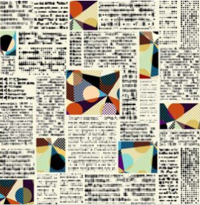
If you stop and think about it, graphic design is literally everywhere. For example, it is on billboards, products, packages, brochures, newspapers, magazines, logos and banners. How boring the world would be without it! As you can see, it applies to just about everything. 
But on this site, we will talk about digital graphic design.
In other words, graphic design for websites, blogs, sales funnels, products, videos, content, and branding.
This site is the language of everything related to digital branding and online sales.
To simplify, you can break graphic design down into “elements” and “principles.” So let’s talk about both, and briefly define each of these concepts.
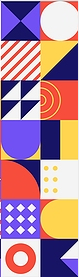
What Are The Design Elements?
There seem to be eight main design elements that make up the most designs on the internet. So, let’s talk about them.
- Line – I think everyone knows what a line is but the point here is that lines can come in all shapes and sizes. They can be fat or thin, wavy or jagged, long or short. Likewise, they can be used for
 emphasis. And you can therefore use them to divide and organize. To guide the eye. To separate by way of color, texture, or style. Font (which is a very big topic) falls under this category.
 - Color – As you can imagine, color is most important when it comes to design. What you may or may not know is that something called a color wheel organizes colors. This is important because certain colors go together and others do not. For example, opposites go together due to contrast. And those on either side do as well. Color helps to persuade.
- Value – This is the spectrum of color. In other words, the same color can go from very dark to very light.
- Shape – this is normally referred to as two-dimensional shapes, such as circles, squares, rectangles, triangles, etc. The shape is important in distinguishing boundaries.
- Form – these are normally referred to as three-dimensional shapes. The world of 3-D. The form gives the illusion of depth.
- Size – this is obvious. Large to small.
- Texture – shades of light and dark that give an image more of a 3D look to it. In the same manner, it makes it look smooth, grassy, angular, etc.
- Space – very critical. The spacing between words, lines, letters, etc. White space (which doesn’t necessarily need to be white) and “negative” space is critical to good design. In other words, space is good. A “crowded” look is not good. Padding is another aspect of good space.
Now, Let’s Talk About The Design Principles
The principles of design are what give it personality. This is what makes images or entire pages appealing versus not. So, let’s talk about it.
- Balance – This is the visual weight of a design. Good graphic design is eye-catching, with a balance that makes sense. Symmetrical is obvious balance. Like two products of equal proportion on a scale. Asymmetrical is when there is still balance, but the proportion is not even. Think of a see-saw where the heavier person is closest to the center and the lighter person is on the other end.
- Hierarchy – this is the overall design and is considered most important because it is what is seen first. The most important message must always loudly and clearly, stand out compared to everything else. This can be done with size, color, italics, bold, etc. Top to bottom and left to right are usually considered in the hierarchy.
- Rhythm – this has to do with repetition, spacing, and timing. Once again, this needs to make sense. A good rhythm in design is important for appeal.
- Contrast – opposites do matter. Oppositional weight, color, texture, shape, etc. helps a design to emphasize what is important, and catch the eye and attention. It needs to be striking, complementary, and appealing.
- Variety – There needs to be enough variety to catch attention and be interesting, but not too much. Too much variety can cause confusion, and make a page look crowded.
- Harmony – This gives a sense of unity, likeness, and repetition.
Some Other Interesting Aspects Of Graphic Design
Let’s throw in a few other graphic design terms for good measure! Just to get us off to a good start here!
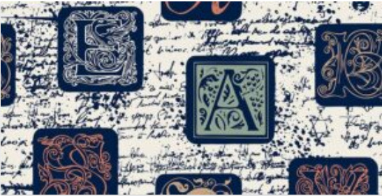
- Fonts – This is also known as “typography.” This is the type and style of letters on a page. Font helps to convey a mood to a design. Most designers recommend not to ever go over two or three (at the most) different fonts on a page. Fonts must complement each other. Go together. Makes sense. Flow.
- Alignment – Good alignment is invisible. But it also needs to be organized and polished. If there was a grid on the page, would the words be off-balance?
- Audience – it is critical to know and understand the people who are going to be looking at the design. For example, highly professional people want simple, organized design. While, people on more of the creative, art, or musical side of things would be more open to breaking the norms. Being “different.” Standing out.
- Consistency and Repetition – This is important in branding. It is recommended to keep the same colors and font throughout. I have been known to change colors, depending on the background, but this could confuse the audience and make the brand less recognizable.
- Distortion – this is a big NO in design. Never, ever distort a picture to fit somewhere. This looks completely unprofessional and should never happen.
- Functionality – what is the purpose of the page or site? This is critical. Most web pages have ONE action for the audience to take. It is important to focus on that ONE action. In other words, don’t confuse others with too many choices. Importantly, this is a copywriting basic.
- First Impression – how can you “wow” your audience when they first arrive at your page? How can you create something special and interesting, just for them?
- Structure – how is the site navigated and organized? Does it make sense?
- Responsiveness – does it look as good on a mobile phone as it does on a desktop? Remember this, a good designer will always improvise and make sure that the design works for all devices.
- Grid – this can set a blueprint for design. The grid is meant to be invisible. It is used to describe other design elements such as the “Rule of 3rds” and the “Golden Ratio.”
- Proportion – what is the relativity between objects on a page? Does it flow smoothly?
- Proximity – This is similar to the familiar saying, “birds of a feather flock together.” In other words, things that make sense need to be grouped together on a page.
Now, we could go on and on about the ways you can make a living with graphic design, the tools needed, and the best ways to learn. In this regard, we will explore all of that on this site.
But one thing you may be wondering. And quite honestly, this is probably what kept me from researching it sooner…
“Do I Need To Be A Good Artist To Be A Graphic Designer?”
And the answer is (thankfully) NO. There are plenty of great “Royalty-Free” sites that offer photos, art, and music for your design. In other words, you can have the right to use them.
Some of those sites are free and others cost money. But either way, all you really need is a good eye for design and love for the work.
In the end, it is your portfolio that matters. Together with a showcase of your work. Experience is more important than education, for the most part.
Remember, graphic design is a language. Correspondingly, its purpose is to “make visual communication interesting and beautiful.” Therefore, it makes websites, products, and sales funnels more interesting, beautiful, and fun.
Graphic Design makes the world more fun, interesting a beautiful place!
I hope you enjoyed this article. You are in the right place if you are interested in learning more about graphic design, building blogs, websites and sales funnels, or product creation.
Would you like to receive several FREE “Beginner to Expert” marketing courses?
Click the banner below to get your first FREE course!